If I were to open a typographic studio (does such a thing exist?) I would call it 'Love Letters'. The best businesses have puns for names. Puns have had a bad run from people who prefer the blank verse of post-modernism.
On the subject of type, I came across this fascinating little slide show on the Penguin blog - to which I now subscribe in my RSS reader (I use a thing called sage, a Firefox plug-in, which is excellent - a revelation, even). The blog is an excellent example of corporate blogging in that it allows its authors to have a voice. Which makes perfect sense, Penguin is not just in the business of editing text, binding it it and distributing - it is in the business of spread the joy of communicating in words. Anyway. I like it.
The slide show discusses five books that have quirky typographic twists to augment the tale. Bear in mind, though, that the use of type in the five examples is not decorative but integrated into the narrative structure.
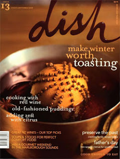
 Footnote: Why have ligatures become such a popular (cliche) motif in design? The New Zealand food magazine Dish should get special mention for its irritating use of ligatures. (Pic shows the winner of Best Cover from the 2008 Qantas Media Awards…oh dear).
FYI: A ligature is a special character that combines two (or sometimes three) letters into a single character. Type designers create ligatures because they look better than setting the same character combinations individually, and also to solve the problem of characters that “crash” into each other when set in adjacent positions. Learning when and how to use ligatures, and when not to, is an important typographic skill.(My italics. Source
More on ligatures here - Will Harris.com (while you are there sign up for his schmooze letter. I used to receive it but I prefer blogs and RSS now)
On the subject of type, I came across this fascinating little slide show on the Penguin blog - to which I now subscribe in my RSS reader (I use a thing called sage, a Firefox plug-in, which is excellent - a revelation, even). The blog is an excellent example of corporate blogging in that it allows its authors to have a voice. Which makes perfect sense, Penguin is not just in the business of editing text, binding it it and distributing - it is in the business of spread the joy of communicating in words. Anyway. I like it.
The slide show discusses five books that have quirky typographic twists to augment the tale. Bear in mind, though, that the use of type in the five examples is not decorative but integrated into the narrative structure.
 Footnote: Why have ligatures become such a popular (cliche) motif in design? The New Zealand food magazine Dish should get special mention for its irritating use of ligatures. (Pic shows the winner of Best Cover from the 2008 Qantas Media Awards…oh dear).
FYI: A ligature is a special character that combines two (or sometimes three) letters into a single character. Type designers create ligatures because they look better than setting the same character combinations individually, and also to solve the problem of characters that “crash” into each other when set in adjacent positions. Learning when and how to use ligatures, and when not to, is an important typographic skill.(My italics. Source
More on ligatures here - Will Harris.com (while you are there sign up for his schmooze letter. I used to receive it but I prefer blogs and RSS now)
Comments
Post a Comment