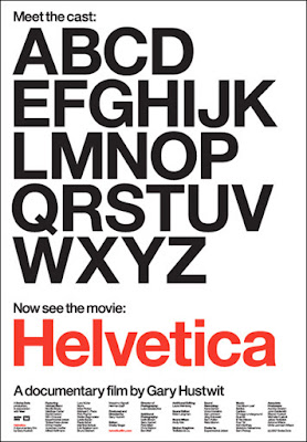
Some things are so ubiquitous that you just stop noticing them. Helvetica is a typeface that is almost omnipresent. It represents modernist, calvanic utility. Well it does to me.
The thing about Helvetica is that it is hard to have an opinion about it. Now you might find it harder to believe that I have no opinion about something, but in this case I think it would be like having an opinion about breathing - interesting but pointless.
In the world of point sizes that point might just be a little more than stretched by the film: Helvetica. That's right, the font is now a film. I like the poster (above), who would have thought? The cast is quite a line up of characters - excuse my lame little type joke there. I'm intrigued. I want to see it. The challenge will be to take something that seems banal and make it entertaining. Mind you, I did enjoy the documentary about Frank Gehry and enjoyed the Line King documentary about Al Hershfeld...so I may actually find myself in my element.
As a footnote I was talking to a colleague at Massey University Design School about teaching typography. I wondered if she went through the old fashioned stuff about ems and ens and picas. The answer is no, they don't. I would have thought that having a knowledge of the traditions of typography would inform new directions. Apparently not.
Comments
Post a Comment